This Map is made available under the CC-0 license.
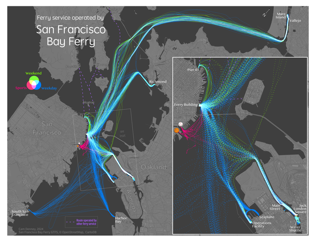
QGIS was used to make this map of ferry service by the San Francisco Bay Ferry company. I used an R script to pull real-time GTFS vessel location data for ~2 weeks of data in Fall of 2024. I then imported that data for cleaning and visualization in QGIS.
Notably, color blending modes were used to create a nice effect showing different ferry routes schedules/services where the location points overlap. I included the large inset map, because zooming in on the central ferry network hub really shows some cool patterns.
The San Francisco Bay Ferry company is one of several ferry operators in the SF Bay Area. Other ferry providers (whom do not provide open vessel location data - boo!) were noted with purple dashed lines.
I wanted to make this map because I regularly use the ferry service between Alameda, Oakland and San Francisco. It is a great transportation service, and has been expanding since the pandemic. The SFBF company provides excellent open data, including real-time locations. Big ups to SFBF for providing quality open data!
Nice map and great description, thank you!
Reviewed by gabrieldeluca 10 months, 2 weeks ago
Thank you!
Reviewed by gabrieldeluca 10 months ago

This Map is made available under the CC-0 license.

Flagship membership

Flagship membership

Large membership

Large membership

Large membership

Large membership

Large membership

Large membership

Large membership

Large membership

Large membership

Large membership